Color can be a very subjective, even emotional topic. We all have our favorite shades and hues that we prefer in our personal lives. But when you’re creating a custom graphic overlay, color can (and should) be very objective and precise. That’s why color-matching techniques come in during the design and printing processes.
Why is color matching important for graphic overlays?
There are several reasons why product designers and OEM’s should emphasize color matching for graphic overlays, including:
- Maintaining branding standards
- Guaranteeing product consistency from run to run
- Creating a clear and easy-to-use user interface
- Meeting both user and industry expectations
Process color versus Pantone
Within industrial printing, there are two standard methods for color reproduction: four-color process and Pantone (spot color).
Process color printing creates layers of four base colors: cyan, magenta, yellow, and black. Also known as CMYK, this is the same method used by most home or office printers with ink cartridges. The mixture and density of the four colors create a broad spectrum of final printed colors. Process color can be a cost-effective and straightforward method for producing multi-color graphics and photos. You can achieve very high-quality images with process color, but the downside is that you might experience some variance if you have a precise color in mind.
The Pantone Color Matching System (PMS) is an industry standard for precise color matching. Spot color means selecting and reproducing a single color rather than multiple colors, as with CMYK. With PMS, you can choose from pre-determined color formulas for highly accurate and consistent printing results. This comes in handy if you want an exact shade of a color. For instance, instead of generalizing a color such as “dark red,” you can select and use a specific PMS number. Working with PMS colors ensures that designers and printers are on the same page for essential colors.
PMS is best suited for printing jobs where color matching for a single or a few colors is very important (such as a logo) or for small, fine text. Alternatively, most Pantone colors can be converted to CMYK, potentially providing a more cost-efficient way to get very close to exact color matching.
How to work with PMS
For product designers interested in precise color matching, the best tool is the Pantone Formula Guide. This book includes chips (samples) of all Pantone colors. To date, PMS offers 1,867 standard spot colors. Most PMS colors are identified by a three- or four-digit number, followed by a ‘C’ (for coated or glossy paper) or ‘U’ (for uncoated paper). This formula code can help you match an already-determined color (such as the required logo color designated in the brand standards) or choose a new color that can be clearly communicated to others.
In addition to the standard PMS colors, Pantone has formula guides for specialty colors, including metallics, pastels, neons, and more.
Factors that influence color accuracy
Once you choose process color or PMS for your graphic overlay, that doesn’t necessarily mean color matching is guaranteed. There are three factors that can impact the accuracy and consistency of printing.
- Computer screen – The colors you see on your screen may not be exactly the same as those that come out of the printers. This is because computer screens can vary based on the model, settings, etc. After a test print, you may have to adjust your design (especially if it's CMYK) to achieve the correct final colors.
- Lighting – Printed colors will look different in various lighting. The ideal condition for color matching is controlled natural light, as this will give you the most accurate representation. However, you may also want to review the colors in the type of light where your product is most likely to be used.
- Materials – The material or substrate that you’re printing on can also impact the final color. Some materials absorb ink or have a glossy finish that can change how the color looks. Working with a printer with material expertise can help you avoid unnecessary reprints or poor color matching based on the substrate.
Quality control for color matching
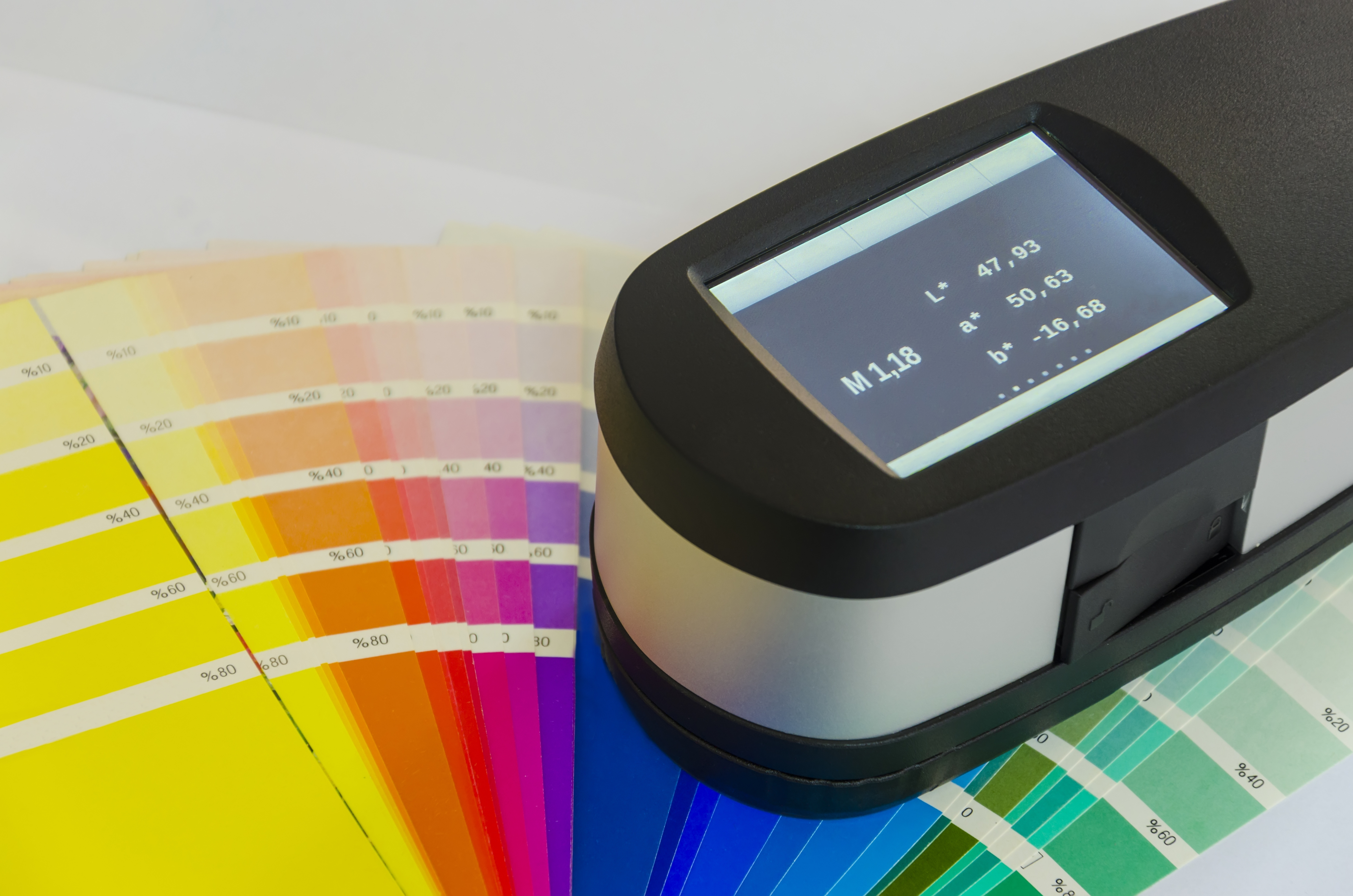
The final step in the color-matching process for graphic overlays is quality control. Traditionally, this entails comparing the printed material to the PMS chip to verify they match. While this method is effective, it does require an experienced eye and can slow down the process to perform manual checks.
At Tapecon, we utilize a more sophisticated method for color matching QA. Our printing team uses an X-Rite eXact™ spectrophotometer to validate and match PMS and CMYK colors before and during printing. Not only does this device allow us to check a printed color in less than a second, but we can also store a client’s PMS colors in a cloud database or connect to the official Pantone library – helping us match colors on the fly for enhanced consistency from run to run.
If you’re interested in learning more about our color-matching process and other cutting-edge printing techniques for graphic overlays, reach out to Tapecon today to start the conversation.
Let’s make something great
With over 100 years of manufacturing experience, Tapecon works with product teams to solve challenges, create products, and enhance lives. Learn more about our graphic overlays applications.